Monday, 10 December 2012

SKOR - identity

SKOR is the Dutch Foundation for Art in Public Space
Lava design agency 


Really interesting identity for a foundation for art in public space where the logo is set with a system of rotation so that it can take many forms on a page. Similar to the logo type for form and writing whereby it can be moved around the page and used differently depending on the format it is applied to. The colour scheme also varies massively however the logo holds it together visually.  

Monday, 3 December 2012

Neubau - Neubauism

Neubau
Neubauism
Identity


Identity and promotional material for an exhibition of Neubau's work. Interesting identity making use of type as the main element, usually with black and one other colour. Not sure whether this identity is as clear as it possibly could be. Especially the posters, where I think the numbers could make it a little confusing. The mix of colours I think works really well and all add together to make a really striking identity.

Neubau - Frame Magazine

Neubau
Frame Magazine 
Publication


Design for Frame magazine by Neubau, really like the composition of the title on the front cover, whereby the type sits flush with the barcodes and pricing information. The layouts seem fairly standard with the inclusion of some fairly interesting typesetting for titles where the letters are all jumbled up. Not sure this is entirely necessary, I think it would work much better with just simple type for headers like in the spread above.

Neubau - Type One

Neubau
Type One 
Research document 


Reserach publication put together by Neubau about the discipline of typography, within graphic design. Think the aesthetic of this being very much a rough and working document is nice, however I think it would also be nice to see a much more refined and finalised version.

Neubau - Susan Hefuna

Neubau
Susan Hefuna - Pars Pro Toto
Type Application


More printed matter by Neubau to showcase a font, and I think this does it much better than the print designed for Rietveld. The colours used here are really nice and the combination of black and white imagery and the strong colours from the cover work really well. The font takes prominence on the cover, again it is worth taking note from Neubau for Form and writing in terms of font specimens.

Neubau - Rietveld

Neubau
Rietveld
Typeface


Abstract font designed by Neubau for which they have produced this bold print. The font is very abstract, to the point where it's very difficult to read so I think this print is literally just an aesthetic piece, not really designed to make people see how well the font works. In this sense, it is not really modernist in style, however the geometric shapes used to make it up very much are, so there's a balance.

Neubau - Nuna

Neubau
Nuna
Identity and Publication


Promotional material for a new ice lolly designed as a collaboration between neubau and an artist. This involved the creation of all the promotional material and a publication showing off the new designs and the development of the identity. Really interesting thing to promote and photographs show off the product brilliantly.

Neubau international

Neubau 
NB International
Font Development 


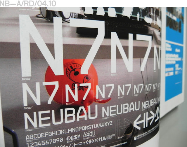
Really interesting examples of print produced in order to promote a typeface designed by Neubau. Really like the mix of very subdued colour for some looking only at off white and black, to the much brighter colours of the others. Keeping them together with the use of bold typography and the designed font, aswell as format. Something to bear in mind for the form and writing type specimens.

Neubau - LaborGras

Neubau
LaborGras
Poster Series 


Modernist style posters by Neubau for LaborGras making use of solely geometric forms, limited colours and a single typeface, in one weight across the series. Very much in the style of modernist design although a little more obviously digitally produced. These seem to get across just the information that is needed, which is what I would like to achieve with my promotions so it's worth taking these into account.