Showing posts with label Good is.... Show all posts

Monday, 21 November 2011

Generation Press - Disaster

Task 4 - Specialist production & definitions.
Generation Press
Disasters


really simplistic publication making use of a fairly heavy black stock with a gold foil blocked title that makes it stand out. Really nice way to work with the process of foil blocking so simply and effectively. Would have loved to produce something like this for my project with a gloss orange foil.

Sunday, 13 November 2011

'What's Next' publication.


Another publication that I think is relevant to the production of my product manual with a very clean and simple layout making use of a minimal colour palette. Really like this layout and would translate really well to a manual style publication, I think the column layout would work nicely.

Next logo development // Paul Rand


 Pages from a publication created by Paul Rand for Steve Jobs regarding the design of a logo for a computing company he worked on after being sacked from apple in his fairly early career. Not a massive fan of the logo although having read it through what Rand has written it is really interesting to see how he has gone about design the logo in such a clever manor.

Simple publication


Another publication that I thought could influence the production of my technical manual. As with most manuals and product guides I want the focus to be on the products and their design as opposed to the design of the manual as such, so the manual will be very simply laid out in order to aid the delivery of the product. This publication makes use of fairly simple layout and only minimal colours and typography to aid the readability of the information in it. Type workshops and so on should really help my production of this manual and the use of typography to aid communication.

technical manual.


A strange old manual in a really interesting style, with a lot of technical drawings, similar to how I intend to use my manual to accompany my products. These I think are for childrens toys similar to mechano or something with a lot of parts. Really like the use of limited colours, and at the time, this would probably have been down to the number of manuals produced and the cost of producing them.

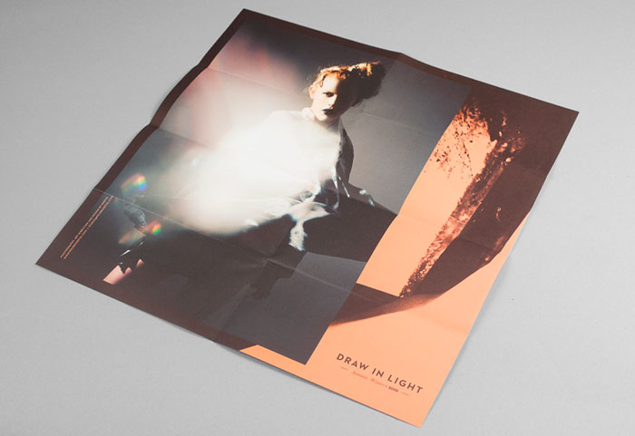
Draw in light // We Are Useful , London


Branding for 'Draw In Light' by London based, We Are Useful, who I must say have an incredibly un-useful website... Despite that, really nice promotional material, making use of some really nice packaging, using a few layers of heavy black stock that contextualise the title 'draw in light'. Thought this was relevant to the production of my manual due to the packaging of the book and general aesthetic.

Scandinavian logos


Some awesome Scandinavian logos from the 70s, completely type based, but there's just something about them that is really cool. The use of colour and minimal style, with clear and concise typefaces is what makes these logos.