Showing posts with label Colour for print. Show all posts

Monday, 10 October 2011

Monochrome identity for Oficina

Task 2 - Colour for print 
Atelier Martino&JaƱa
Monochrome


This is an identity for Ofcina that I found on behance. It's monochrome printing which makes use of both negative space and positive. Although the type looks very crisp and quite nicely considered, I find that the logo looks abit clumsy. This may be because of the shape or the size at which they have placed it into the designs, but I don't really like it. I do like the simplicity of the identity and I think it could have been a little more refined. I like that it would work in other colours, due to it being monochrome it could be adapted.

Sueh Li Modus Operandi branding

Task 2 - Colour for print 
Sueh Li
CMYK


Branding by Sueh Li for something called Modus Operandi which I think would have been printed CMYK. Despite there not being all the colours visibly, It is clear that Cyan, Magenta and very possibly yellow have been applied to get the effects of gradient and also that it wouldn't be financially viable to use spot colours on this when CMYK is available. A really interesting and quite distinctive identity though.

Julien Lauzon self branding

Task 2 - Colour for print 
Julien Lauzon 
Monochrome


Monochrome self branding by Julien Lauzon which I really like just because of the simplicity. I think often when working with one colour the temptation is to try and make up for the fact theres no other colours by using very bold shapes and typefaces. However here is a much simpler use of the monochrome palette, In this instance, black, using fine line weight and not overpowering the layout with a bold face.

Original classics branding

Task 2 - Colour for print 
Original classics 
Spot colour


An extensive and complete branding project by 'Original Classics' that from what I can see makes use of four spot colours and black, However it is quite possible that these are simply CMYK colours. I think for ease it would use them as spot colours so that they as near as possible to being right on every element of the branding.

Mucho design spot colour publication

Task 2 - Colour for print 
Mucho Design 
Spot colour


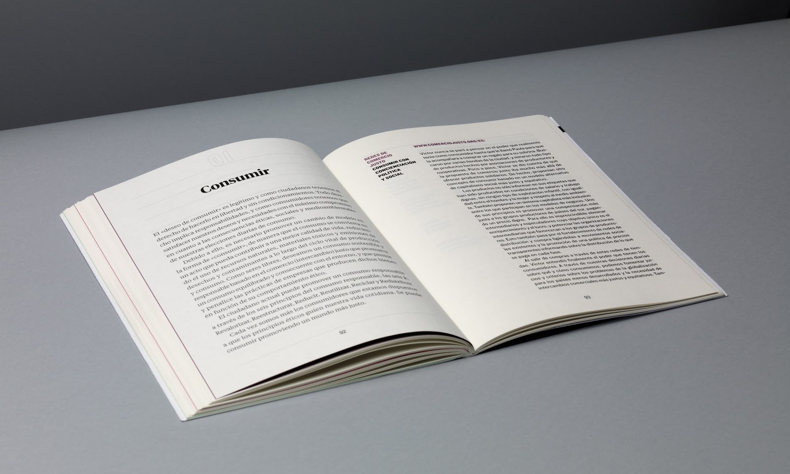
A really nice, yet simple publication by Mucho design studio that makes use of black and three spot colours throughout. These colors seem to split the book up into sections, within which is only that one spot colour and black. I think this is a really clever way of differentiating between the 'chapters' or sections of the book. I think the clear layout and nice choice of a slightly off white stock also helps the finish of this booklet.

Spot colour branding

Task 2 - Colour for print
Spot colour


I've labelled this as use of spot colour as I think the blue of the gradient images is a little too intense to create with CMYK and would make more sense for this to be a bright spot colour. Especially with something like branding it's important that the colour is right on every piece of stationary no matter where it is printed as it may be synonymous with the identity.

Say what Spot colour printing

Task 2 - Colour for print  
'Say What' design
Spot colour


Another example of a publication that could very possibly be produced using CMYK printing methods, using a blue mixed with magenta and black. However I'd like to think this is produced with black and a dark blue spot colour. Again something that is easily specified to the printer and will be right everytime.

Spot colour spreads

Task 2 - Colour for print
Spot colour


Although I may have put this up before I think it fits more effectively into this task whilst looking at colour for print. Again, another example that could quite possibly be done using CMYK printing, however I think this is done using spot colours onto a yellow stock. A nicely laid out publication making use of tints of a cyan and yellow spot.

Livery Publiction

Task 2 - Colour for print 
Spot colour


A publication outlining the branding and liveries for a company called aeras, whom I assume are some kind of aviation company. Although there are sections of what look like CMYK photography in this book, I think it's clear that the blue used will be a spot colour, picked out specifically for the branding of this company. The application of which throughout the book really helps clarify the choice of spot and give an interesting proposal, rather than a dull publication.