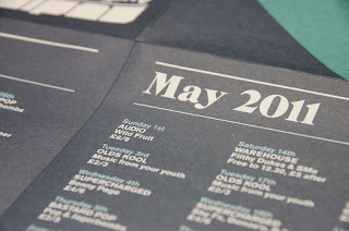
here are shots of some promotion for a club called 'Audio' and I think they are really nicely designed for something like this. They have a very relevant aesthetic yet still seem quite fresh and different from other club fliers and promotion, this may interest the people it is given to a bit more. I imagine it would be given to possible patrons of the club via flyering which is why it has to stand out. A smaller scale is better for large scale print runs and practicality.


No comments:
Post a Comment