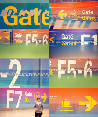
More wayfinding developed for an airport from early stages of logo design and branding to the latter stages of development and implementation of the system. Interesting yet fairly sensible to see that the colour pallette for all the design was based on the sky and its many colours. Very simple type and use of huge symbols make this way finding system very easy to use, perfect for an airport.


No comments:
Post a Comment