Henrik Nygren
Baltic Identity
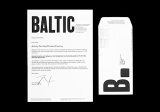
Bold identity for the Baltic in Newcastle by Henrik Nygren, Really like the scale of the logotype across the range of stationary and also the use of the abbreviated title with a full stop as a main element. Think it works really well as a range, with the majority in black and white with some really strong colours applied in certain areas.


No comments:
Post a Comment