Showing posts with label Branding and identity. Show all posts

Friday, 2 March 2012

Rob Van Hoesel

A designer based in the Netherlands that I came across whilst browsing a creative blog. Really like the work he produces, someone I'd be very interested in contacting despite being based in the Netherlands.

Publication   
Spaces and Places in between
Publication, poster and CD


A music based publication produced as a pack with a CD and trace printed poster. Really like the format used for the presentation of this publication and the use of type. Using the poster as a form of packaging, keeping the booklet and CD together is really interesting and the way the design on the trace interacts with the design beneath it on the cover of the book creates a really interesting aesthetic. The publication contains some really simple layouts with only a few hundred words and an image but it seems to work really well.

Identity
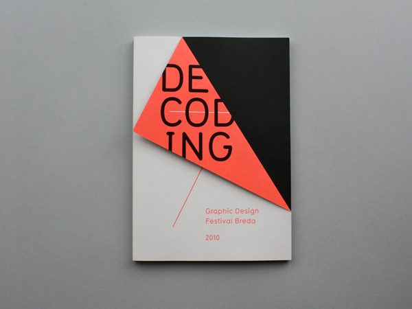
Graphic Design Festival, Breda
Identity, catalogue and event promo


Identity and catalogue for a graphic design festival in the Netherlands. Really strong yet incredibly simple visual mark, with an aesthetic running across all media. Love the use of the fold for the cover of the publications conextualising the mark and creating an interesting difference throughout the entire identity.

Dieuwertje Komen
Identity


Really simple identity for a photographer using a shape based around the negatives and visualisation of the photographers work. Again really simple but effective, colours used to give a slightly more feminine feel to the overall identity due to the photographer being female.

Monday, 21 November 2011

Ross gunter - John Rocha

Task 4 - Specialist production & definitions.
Ross Gunter 
John Rocha


Business cards for John Rocha by Ross Gunter, a designer who I have posted on my blog on a few occasions. very simplistic, with no in applied to the front surface of the cards, only debossed type. Which I think even for non-designers would create intrigue and make it more tactile. The back is then very simply laid out type in two colurs with a difference in type weight for emphasis.

Tsto - Camino branding

Task 4 - Specialist production & definitions.
Tsto
Camino branding


Very minimal branding by Tsto created almost entirely around a debossing stamp, that creates a relief of the logo, giving the effect that it stands off the page. This comes on an envelope, letterhead and business card and it is a handy size to fit them all nicely. The clean typographic layout accompanying this stamp really accentuates it. Nice!

Generation Press

Task 4 - Specialist production & definitions.
Generation Press 
Branding


Really nice indentity by Generation Press produced on an edge printed stock in what looks like recycled board/paper. Brilliant use of colour, matching the edge of the stock to other items of stationary and applying the embossed and foil blocked logo simply throughout. Beautiful.

Septmeber Industry - Interesting invitations.

Task 4 - Specialist production & definitions.
Septmeber Industry 
Banana leaf invitation.


Printing onto very exotic substrate in the form an invitation, created with metallic printing onto banana leaves. Despite this interesting stock, the rest of the promotion doesn't really seem to go with it, and has a very bright and garish appearance. Still interesting but not really fitting.

Generation press Pulp-Paper

Task 4 - specialist production & definitions

Generation Press
Pulp-paper promotions


A series of invitations and publications by generation press for pulp-paper which makes use of an array of special stocks and print processes to give a very simple yet effective outcome. The main processes involved being embossing, both on the covers, and in the fine detail on the spine of the book. also there are duplex stocks for the invitations that give a really crisp finish.

September Industry

Task 4 - Specialist production & definitions.
Septmeber Industry 
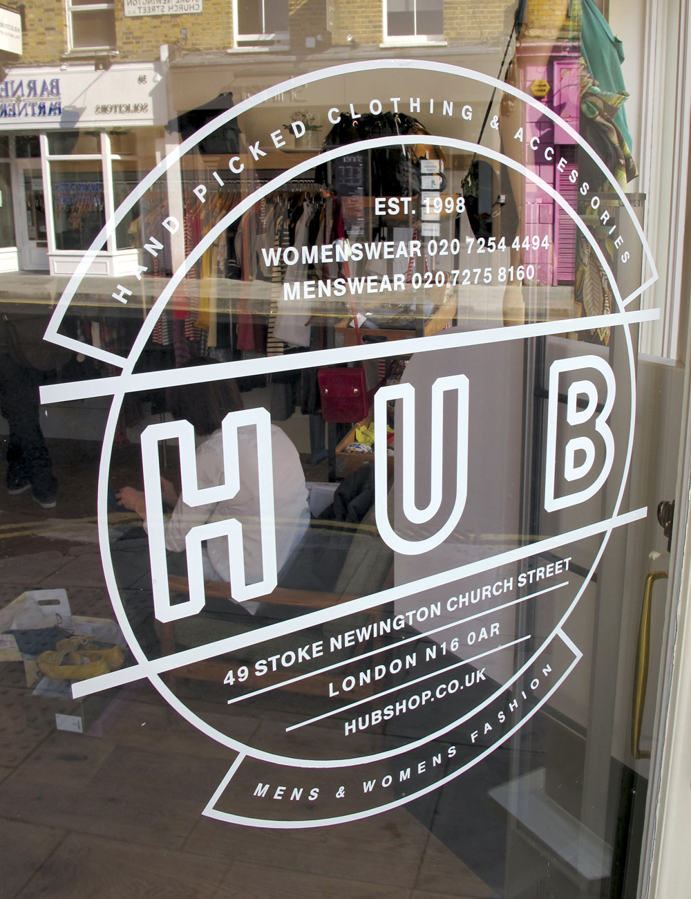
Hub Identity.


Branding and identity for 'Hub' a clothing brand based in London. Really interesting use of print process in combination with a variety of substrates such as recycled board, windows, stickers and tote bags. Simplicity and a retro feel logo gives the brand a really interesting aesthetic and fits with the style that they appear to be trying to portray in their clothing and shop.