Showing posts with label opposites. Show all posts
Thursday, 26 May 2011
Use of colour.
Really nice image based design that looks at the juxta-position of colours, particularly the use of one colour.
Flavour.
Another typographic installment that looks at using unconventional forms of type to portray a message. In this case the effects of smoking.
Enjoy.
Really interesting typographic installment created using nails through a board and the word enjoy, things you possibly wouldn't usually get together. The nails were also made to rust to give them a different appearance from the other nails in the board.
Monday, 28 March 2011
nice colour combo.
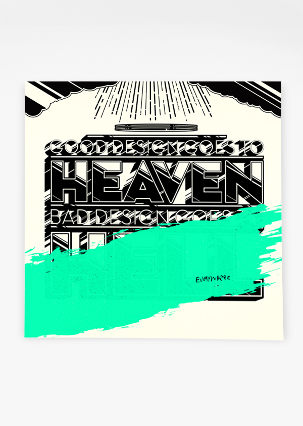
Here are a few posters I found that I think are relevant to my opposites brief. Having chosen colour as my topic of focus, I think they illustrate this really nicely. Some show colour combinations, some show use of opacities and this one above shows the use of an opposite colour gradient, which I don't like so much, but it's relevant for sure.
Labels:
Colour theory,
opposites,
OUGD103,
OUGD104
Subscribe to:
Posts (Atom)