Showing posts with label Publishing and Editorial. Show all posts

Friday, 2 March 2012

Rob Van Hoesel

A designer based in the Netherlands that I came across whilst browsing a creative blog. Really like the work he produces, someone I'd be very interested in contacting despite being based in the Netherlands.

Publication   
Spaces and Places in between
Publication, poster and CD


A music based publication produced as a pack with a CD and trace printed poster. Really like the format used for the presentation of this publication and the use of type. Using the poster as a form of packaging, keeping the booklet and CD together is really interesting and the way the design on the trace interacts with the design beneath it on the cover of the book creates a really interesting aesthetic. The publication contains some really simple layouts with only a few hundred words and an image but it seems to work really well.

Identity
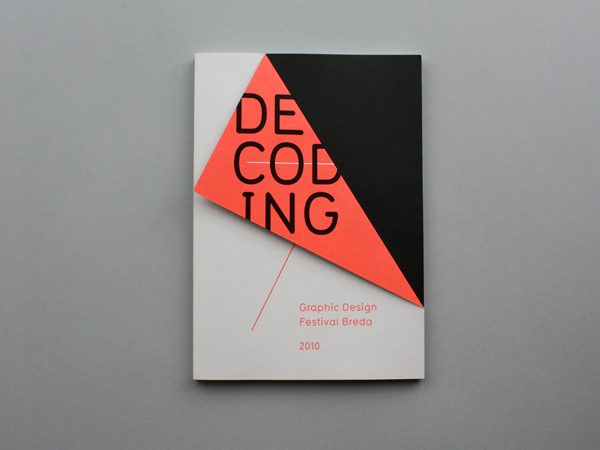
Graphic Design Festival, Breda
Identity, catalogue and event promo


Identity and catalogue for a graphic design festival in the Netherlands. Really strong yet incredibly simple visual mark, with an aesthetic running across all media. Love the use of the fold for the cover of the publications conextualising the mark and creating an interesting difference throughout the entire identity.

Dieuwertje Komen
Identity


Really simple identity for a photographer using a shape based around the negatives and visualisation of the photographers work. Again really simple but effective, colours used to give a slightly more feminine feel to the overall identity due to the photographer being female.

Monday, 21 November 2011

September industries - nike publication.

Task 4 - Specialist production & definitions.
September Industries
Nike publication.


A really nicely produced publication by September industries that makes use of a really clean and professional finish in the binding process. Lots of print processes going on inside the book and also an embossed title on the cover bookrum. Really simple yet effective.

September industries - golden

Task 4 - Specialist production & definitions.
September Industries 
Golden


A book flaunting a number of printing and binding processes that give it the most expensive feel possible, the gold certainly helps. Really like the binding style, giving quite a raw edge with the visible stitches and gold pages. The edge of each page is gold further adding to the exclusive appearance of the book. Gold foil on the front for the title simply adds to the shine. Really effective use of available processes.

Generation Press - Disaster

Task 4 - Specialist production & definitions.
Generation Press
Disasters


really simplistic publication making use of a fairly heavy black stock with a gold foil blocked title that makes it stand out. Really nice way to work with the process of foil blocking so simply and effectively. Would have loved to produce something like this for my project with a gloss orange foil.

IKEA. encompassing.

 Task 4 - Specialist production & definitions.
IKEA
brading & packaging.


Packaging, editorial, branding and product for an ikea range. Really like these because of the interesting use of substrate for a large shop like Ikea... really interesting color combos and very simple designs that provide ease of use.

Tsto info & wayfinding

Task 4 - Specialist production & definitions.
Tsto
...


Branding, info and wayfinding for an event by Tsto. Although it is in a different language and I have no idea what it's about, there is a really stong visual throughout the identity and in the event. Colours are consistent throughout and really beautifully designed and printed booklets with 2 colours finish off this project.

Generation Press - Awe magazine

Task 4 - Specialist production & definitions.
Generation Press
Awe Magazine - No 1.


Another beautiful example of print from Generation Press. I've chosen this example because of the processes involved and also the variation in stock throughout the publication. Very nice magenta gloss foil on the cover with a variation of substrates within. Also what looks like quite specialist inks in small areas, such as the image above showing a fluorescent ink for just one page.