Thursday 22 March 2012

Studio Airport - again

 The Museum Attendant


Jozef Ondrik


David Barath


Studio Wilfredtimo


Studio Airport.

Urban Design
A project by Netherlands based, Studio Airport in which they have made use of paper and print in a rather interesting way. Really like the idea of using perspective to create the impression of a flat image, and also the way that the type goes across a variety of surfaces, yet remains legible. Could be used in a similar way to our project, with a much more precise layering technique.
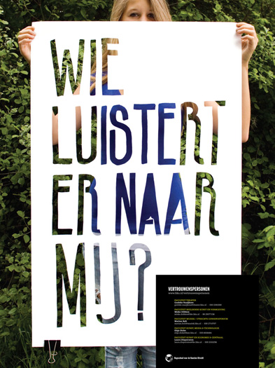


The Counselors
Two posters designed to make students aware of the counseling services available to them. Just picked these out because of the use of paper, within a photographic composition to create a poster. This has also been combined with a small section of type that seems to have sampled colours from within the photos. Really strong visually.


Bisgrafic

Bisgrafic


 A poster making use of photography and print. Showing all the information necessary on a print that is being held be someone. Different use of print as it requires more work due to the extra process of photography involved.


Like the use of gradients in these and also the type. Obviously these gradients are printed, unlike those that we've created using paper, however it's definitely another way of looking at the application of gradients. Placing the poster in a layout like this also shows that the gradient is continuous across all of them.

Wednesday 21 March 2012

Aron Fay


Experiment by a print based design called Aron Fay with conductive print. Where conductive ink is printed onto the paper and reacts when touched. A very interesting use of paper and a process I was unaware of. Also interesting in the delivery of this project, still print based, as a video, the movement of the paper being key to the effect.


Clinton Stringer


 Some posters created using crafted paper shapes photographed on a coloured background. I think the type is then applied digitally however I'm not entirely sure. Chose these because aswell of the use of paper craft, there is good use of colour in a fairly bold manor.

Ruth Tsang - folding.


Bettina Kast - Paper craft


Some really interesting patterns created with paper craft using the faces of a cube like shape to create shadow forming the pattern. It is a very interesting idea but there is clearly a huge amount of time gone into making these and may not be the best use of time or the media in our case.

Tuesday 13 March 2012

Paper animation.


Amazing paper animation called 'The Wolf I used to be' by London based Nearly Normal. Really intricate paper models beautifully made and brilliantly animated. Interesting use of paper, despite the clear length of time it would have taken.


Monday 12 March 2012

Mangoola identity


Really interesting identity for a coal mine in Australia by Sydney based studio End of Work. This identity focused on creating visualisations of the aboriginal word 'Mangoola' aswell as the act of mining, such as the layers of the Earth's crust. I have focused on this however mainly because of the use of the paper crafting on the centre fold of the publication.