
Tuesday, 26 October 2010
Penguin Books... Ian Fleming 007.


Pelican book covers...


Here are a few examples of some classic pelican book covers which make use of really simple layouts and imagery to get across their message. For example there is one book called 'the divided self' which makes use of a series of circles which cross... looking as if they all came from one, and there is a series using this same technique. Really clever and simple design.
Radiohead - Street Spirit (Fade Out)
This is a really awesome video for Radioheads 'Street spirit', directed by Jonathan Glazer, who said, "That was definitely a turning point in my own work. I knew when I finished that, because they found their own voices as an artist, at that point, I felt like I got close to whatever mine was, and I felt confident that I could do things that emoted, that had some kind of poetic as well as prosaic value."
I love this video because of it use of really simple imagery yet when you look closer there is a huge amount of detail in each scene.
Si Scott...


These two portray Si Scotts style of illustration and choice of imagery really nicely. He looks a lot at the texture and shapes created by wildlife, which he then brings into his typographic layouts and all other design. His style of illustration I think is really impressive...


Magomed Dovjenko - "thinking negative can be useful"


Magomed Dovjenko again...


Magomed Dovjenko, "Proof7"

Wax:on flier.

Topshop flier


Friday, 22 October 2010
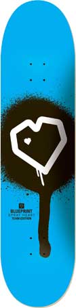
Blueprint...


Inspiration pad


These are some pages from a book called inspiration pad. It is basically a note pad in which the designer has changed the layout of the page, taking lined paper in a whole new way. Again really simple but it has some really interesting effects.
An Incomplete Manifesto for Growth...


Storm Thorgerson
Here are some of Storm Thorgerson's photos which are always really surreal. Although dark side of the moon is a brilliantly designed album cover and doesn't really follow the rest of his work, its just so simple and works so well. although the concepts behind his photos for album art aren't always obvious, I think it is the small details and the great lengths that he goes, to get these right that make his photos.


Subscribe to:
Posts (Atom)