Showing posts with label typografia 2. Show all posts

Monday, 3 December 2012

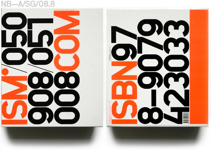
Neubau - Neubauism

Neubau
Neubauism
Identity


Identity and promotional material for an exhibition of Neubau's work. Interesting identity making use of type as the main element, usually with black and one other colour. Not sure whether this identity is as clear as it possibly could be. Especially the posters, where I think the numbers could make it a little confusing. The mix of colours I think works really well and all add together to make a really striking identity.

Neubau - Type One

Neubau
Type One 
Research document 


Reserach publication put together by Neubau about the discipline of typography, within graphic design. Think the aesthetic of this being very much a rough and working document is nice, however I think it would also be nice to see a much more refined and finalised version.

Neubau - Nuna

Neubau
Nuna
Identity and Publication


Promotional material for a new ice lolly designed as a collaboration between neubau and an artist. This involved the creation of all the promotional material and a publication showing off the new designs and the development of the identity. Really interesting thing to promote and photographs show off the product brilliantly.

Neubau international

Neubau 
NB International
Font Development 


Really interesting examples of print produced in order to promote a typeface designed by Neubau. Really like the mix of very subdued colour for some looking only at off white and black, to the much brighter colours of the others. Keeping them together with the use of bold typography and the designed font, aswell as format. Something to bear in mind for the form and writing type specimens.