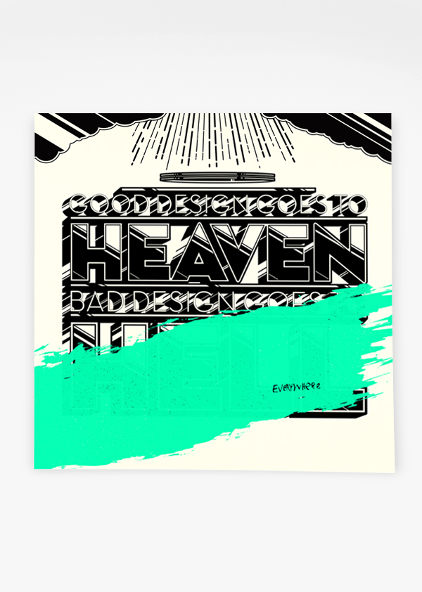
More prints by Joshua Budich, again, the way the images are composed and so on I think gives the people in them an air of power and authority, the colours and the fact that they are iconic figures helps.
This is a series of prints by a graphic artist called Joshua Budich... in these prints he was looking at certain figures from music and popular culture, I think they are relevant to my concept of 'the feeling of invincibility' because they portray these people in a light that could almost make them appear superhuman (or better than everyone else)