Monday, 26 September 2011

Give & Take exhibition graphics, Frost design


Pictures from the book Mapping and Navigational systems which shows the graphics designed for an exhibition at the Victoria & Albert Museum in London by Frost design. I think these are really effective print solutions to the problem of navigation because of their simplicity. All there is, is a very bold, orange arrow directing viewers through the gallery space.

Schobel branding.


More branding, this time looking at a company called Schobel. This is branding by the firm Psyrup and is in a very similar vein to their own identity. Really like the use of colour co-ordination, for the bottles and also the printing on the protective packaging for the bottles. The corrugated card makes for a really interesting effect when printed on.

Psyrup identity.


Some really interesting branding for Psyrup. Very thorough and extensive branding which is all nicely considered and professional. I also really love the use of the wax stamp, something which is very rarely seen in modern use... and works brilliantly in this case.

Struktur Design program information.


Information posters and spreads for a conference held in Dubai and Abu Dhabi in 2007. Designed to look as abstracted as possible from the original maps they were taken from with the use of colour and composition. I really like the type in these spreads...

Nice publication.

 An interesting publication I found browsing the internet that caught my eye because of the use of colour and stock. The combination of which makes for a very interesting aesthetic. I also like how the pages differ so much, one double page spread being made up primarily of image, one rather more minimalist, and another with a combination of the two.


Hornall Anderson


Environmental design by Hornall Anderson for Sky deck in the Willis Building. This pictures I took from Graphis Design Annual 2011, however I wanted to get some better images so I went onto their website to aquire some better images. I think aswell as large installed pieces, they have used printed pieces very well in order to help people find their way around the building effectively. They have also designed a form of identity to go with it...


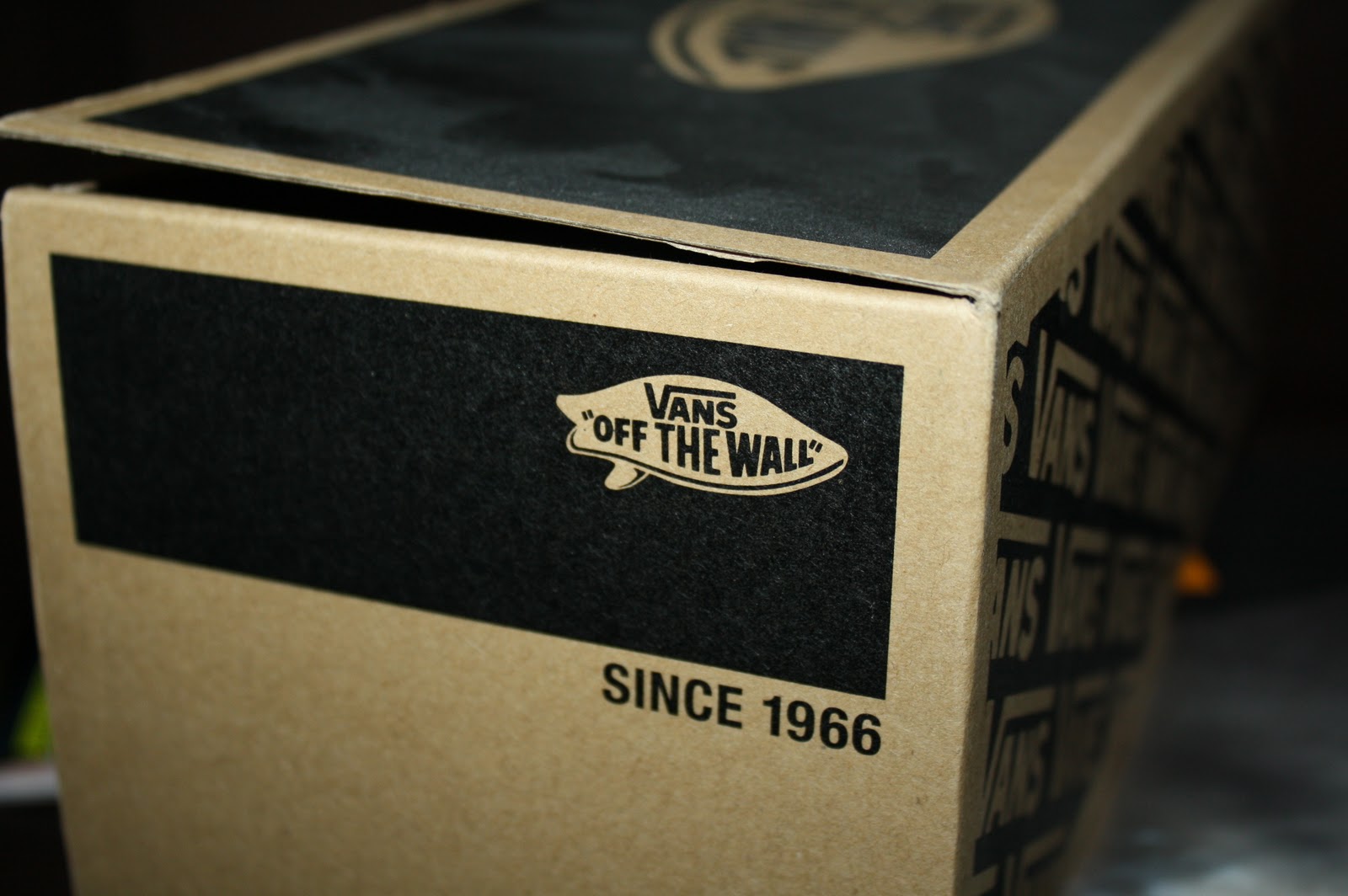
Vans box.


Photographs and scans of the packaging from a pair of Vans shoes I recently bought. I like the scale of this box, as it is not the size I recognize for shoe boxes, and I also like how the design is printed directly onto the card of the box... The paper inside has some nice repeatable type too.