Monday, 21 November 2011

Tsto info & wayfinding

Task 4 - Specialist production & definitions.
Tsto
...


Branding, info and wayfinding for an event by Tsto. Although it is in a different language and I have no idea what it's about, there is a really stong visual throughout the identity and in the event. Colours are consistent throughout and really beautifully designed and printed booklets with 2 colours finish off this project.

September Industries - Morse Studio wayfinding.

Task 4 - Specialist production & definitions.
Septmeber Industry 
Morse Studio 


Some very nice wayfinding from September Industries for Morse Studios which stays simple and clear for effective communication. Colour makes it evident that it's all of the same design and pointing people to the same place and printed onto cardboard, built up into boxes for a different take on wayfinding within the environment.

Septmeber Industry - Interesting invitations.

Task 4 - Specialist production & definitions.
Septmeber Industry 
Banana leaf invitation.


Printing onto very exotic substrate in the form an invitation, created with metallic printing onto banana leaves. Despite this interesting stock, the rest of the promotion doesn't really seem to go with it, and has a very bright and garish appearance. Still interesting but not really fitting.

Generation Press - Awe magazine

Task 4 - Specialist production & definitions.
Generation Press
Awe Magazine - No 1.


Another beautiful example of print from Generation Press. I've chosen this example because of the processes involved and also the variation in stock throughout the publication. Very nice magenta gloss foil on the cover with a variation of substrates within. Also what looks like quite specialist inks in small areas, such as the image above showing a fluorescent ink for just one page.

Generation press Pulp-Paper

Task 4 - specialist production & definitions

Generation Press
Pulp-paper promotions


A series of invitations and publications by generation press for pulp-paper which makes use of an array of special stocks and print processes to give a very simple yet effective outcome. The main processes involved being embossing, both on the covers, and in the fine detail on the spine of the book. also there are duplex stocks for the invitations that give a really crisp finish.

September Industry

Task 4 - Specialist production & definitions.
Septmeber Industry 
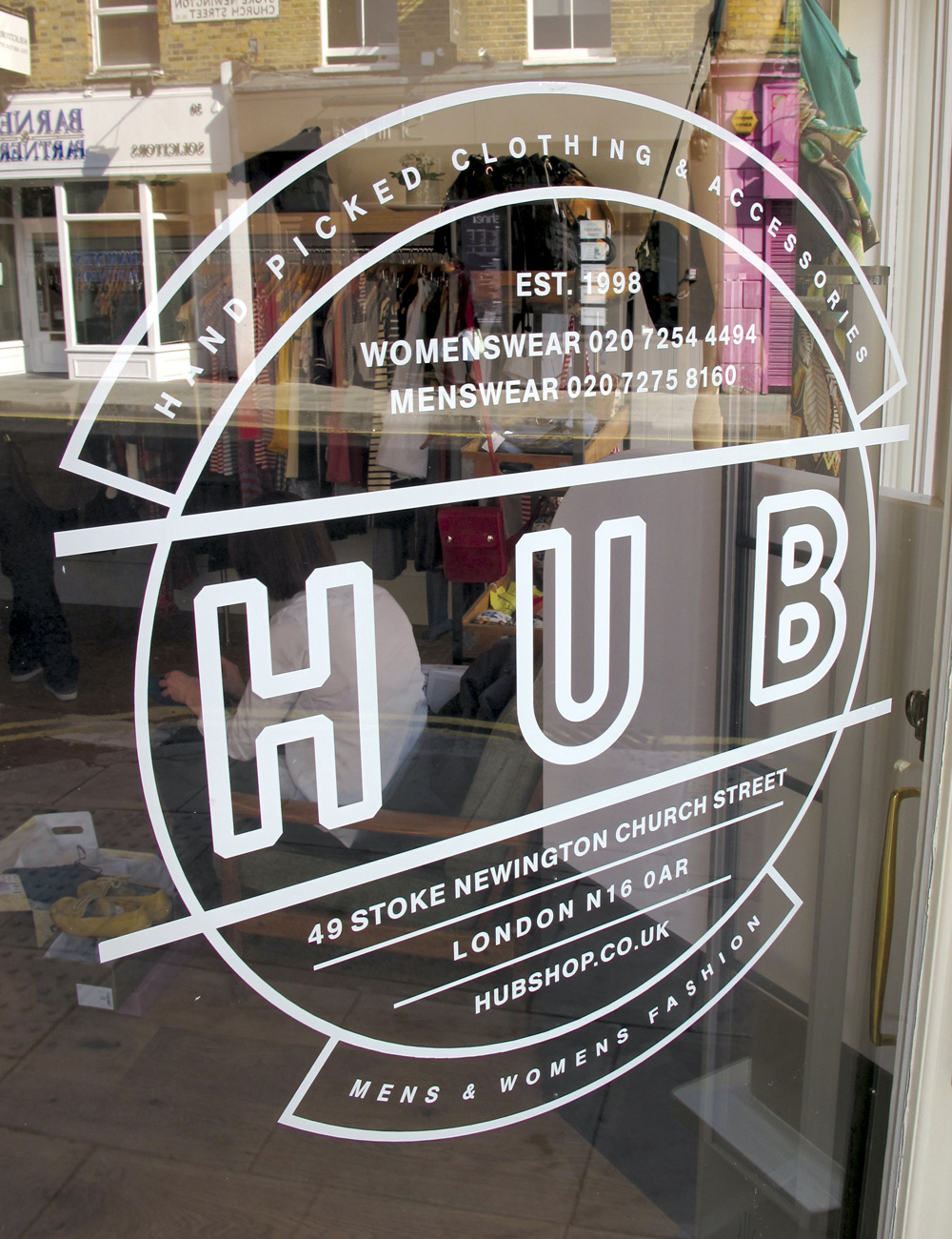
Hub Identity.


Branding and identity for 'Hub' a clothing brand based in London. Really interesting use of print process in combination with a variety of substrates such as recycled board, windows, stickers and tote bags. Simplicity and a retro feel logo gives the brand a really interesting aesthetic and fits with the style that they appear to be trying to portray in their clothing and shop.

Sunday, 13 November 2011

'What's Next' publication.


Another publication that I think is relevant to the production of my product manual with a very clean and simple layout making use of a minimal colour palette. Really like this layout and would translate really well to a manual style publication, I think the column layout would work nicely.