Interesting to see the development of the brand itself and the packaging working together, going all the way from initial ideas, to logo development and the final packaged product. Despite this, I'm not sure on the choice of the final packaging, although there are some nice techniques I think some of the previous designs are stronger as they use the packaging itself more effectively. Also I think the colour of the bottle for the chosen final is much too strong for the brand, using the colours of the fruit for the bottles I preferred, however this is only my opinion and it still shows a nice development.
Monday, 26 September 2011
Wayfinding Design for International Digital Media & Arts Association
Very simple wayfinding devices for the International Digital Media & Arts Association by Vince Lo. Very clear due to the small amount of information on each piece which I think is the best way for it, and also great positioning of the signage to get the best contrast between it and the backdrop. I think in this case, simple is definitely the best.
Loose leaf...
This is Loose Leaf by Manual... It's a publication that features large format printed art works, each edition comes packaged ready to hang on your wall. In essence it is a publication, however it is designed in a way that instructs you on the hanging of the works. A really clever idea with bold and concise design I think.
Per Söderberg identity.

Another identity by Kurppa Hosk the Swedish firm for an architect, however this time it has much wider brand application. For example they were also tasked to create publication, and event promotion material, all in keeping with the identity. I like how the pieces all seem very different but are brought together by the implication of the very simple logotype.
Whyte Lilja identity.
Identity for an Architects office by Swedish based, Kurppa Hosk, really simple and crisp layouts that remain visually appealing and eye catching as an identity. Like the choice of stock and the much finer details of this identity, such as the slight indents on the titles to make the business cards more tactile, and hopefully more memorable to customers.
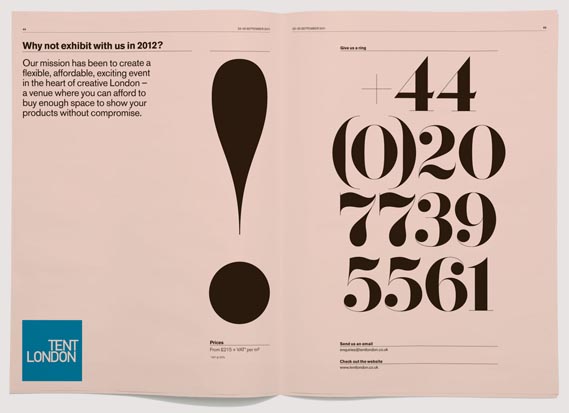
London Design Festival Publication.
Publication designed for London Design Festival's Tent London Show, really beautifully designed, great use of the chosen font and also great choice of stock. Very simple and very effective publication.
Really inventive print
A photo of German design firm Strichpunkt's annual summer party invitation printed onto inflatable cushions. I think this is a really interesting idea and was intended to be used at the party as they were expecting to run out of seats, so people that received it could bring the invitation to sit on...
Subscribe to:
Posts (Atom)