Wire design
Beyond Big Type
Signange & print collateral
Showing posts with label Product range distribution. Show all posts
Thursday, 24 May 2012
Tuesday, 8 May 2012
Stockholm Design Lab
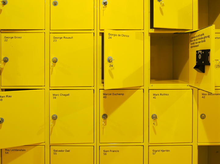
Moderna Museet
Promotion and exhibition environments
Above are some really interesting graphics for an exhibition by Stockholm Design Lab and although I think that most of the examples of the graphics in the environment are photoshopped there is still are really great idea of how they will look in context. I'm unsure as to what this exhibition is about however I think that the abstract shapes used in the promotional material are really eye catching, and the use of these throughout the printed material really gives the material a nice visual consistency.
Promotional material and environmental design for the Moderna Museet. Interesting choice of typeface for the museum logotype, however I think it works really well and seems to have been applied really effectively throughout the exhibitions and promotion. The artistic brush aesthetic of the logo compliments the other faces used, and is relevant to the subject to which it is being applied, a museum. I particularly like the photographs showing the things they've applied the logo to, such as a toothbrush and a balloon. These aren't necessarily things that would be sold or seen within the museum, but show nicely how the face can be applied effectively to almost anything.
Moderna Museet
Promotion and exhibition environments
Above are some really interesting graphics for an exhibition by Stockholm Design Lab and although I think that most of the examples of the graphics in the environment are photoshopped there is still are really great idea of how they will look in context. I'm unsure as to what this exhibition is about however I think that the abstract shapes used in the promotional material are really eye catching, and the use of these throughout the printed material really gives the material a nice visual consistency.
Promotional material and environmental design for the Moderna Museet. Interesting choice of typeface for the museum logotype, however I think it works really well and seems to have been applied really effectively throughout the exhibitions and promotion. The artistic brush aesthetic of the logo compliments the other faces used, and is relevant to the subject to which it is being applied, a museum. I particularly like the photographs showing the things they've applied the logo to, such as a toothbrush and a balloon. These aren't necessarily things that would be sold or seen within the museum, but show nicely how the face can be applied effectively to almost anything.
Triboro
Triboro
Red Shift Film Festival
web presence, publication & mail-out
Identity for a film festival, with a really nice name that has been dealt with visually really nicely. Although very simple, the use of the reflective and slightly holographic surface of a CD has been used nicely to contextualise the name. Then a pattern has been created which has then been applied to the branding in both a violet shade and tones of black to equal effect. Although there's not a huge range of product here, it's interesting to see the use of visuals throughout with differing colour ways that still work just as effectively.
Dia 2011
Invitation to Dia art foundation annual gala
AIGA 50/50
Exhibition design and publication
Red Shift Film Festival
web presence, publication & mail-out
Identity for a film festival, with a really nice name that has been dealt with visually really nicely. Although very simple, the use of the reflective and slightly holographic surface of a CD has been used nicely to contextualise the name. Then a pattern has been created which has then been applied to the branding in both a violet shade and tones of black to equal effect. Although there's not a huge range of product here, it's interesting to see the use of visuals throughout with differing colour ways that still work just as effectively.
Dia 2011
Invitation to Dia art foundation annual gala
AIGA 50/50
Exhibition design and publication
Research & development
Cap&design
cover and layouts
Here are some really nice yet incredibly simple layouts for a swedish magazine making use of what could be described as the international typographic style. Reminiscent of modernist graphic designers. This is a style I personally really admire and think the application of it in contemporary design can be really effective.
Design stockholm
Publication
More design for a Swedish publication in a similar, modernist style. However this one makes use of a much more contemporary image layout, which appear to be placed randomly across the cover.
Stop Making Sense
Exhibition Catalogue & signage
Exhibition collateral making use of research and developments fairly simplistic style, one that I'm interested in applying to my own exhibition identity.
Recycling stuff...
Interesting use of a text overlay on imagery. Really vibrant blue on the bottom image however it looks as if from the top image it may have been a much paler blue. I'd be interested in finding some colours that are quite as vibrant for the design I'm doing.
Cap&design
cover and layouts
Here are some really nice yet incredibly simple layouts for a swedish magazine making use of what could be described as the international typographic style. Reminiscent of modernist graphic designers. This is a style I personally really admire and think the application of it in contemporary design can be really effective.
Design stockholm
Publication
More design for a Swedish publication in a similar, modernist style. However this one makes use of a much more contemporary image layout, which appear to be placed randomly across the cover.
Stop Making Sense
Exhibition Catalogue & signage
Exhibition collateral making use of research and developments fairly simplistic style, one that I'm interested in applying to my own exhibition identity.
Recycling stuff...
Interesting use of a text overlay on imagery. Really vibrant blue on the bottom image however it looks as if from the top image it may have been a much paler blue. I'd be interested in finding some colours that are quite as vibrant for the design I'm doing.
Subscribe to:
Posts (Atom)