Thursday, 26 May 2011
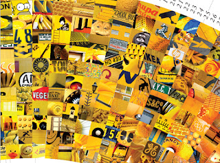
Use of colour.
Really nice image based design that looks at the juxta-position of colours, particularly the use of one colour.
Flavour.
Another typographic installment that looks at using unconventional forms of type to portray a message. In this case the effects of smoking.
Enjoy.
Really interesting typographic installment created using nails through a board and the word enjoy, things you possibly wouldn't usually get together. The nails were also made to rust to give them a different appearance from the other nails in the board.
Tuesday, 24 May 2011
Sindustry promotion.

This is a promotional Pack for a band called Sindustry so the idea is to communicate what the band is about and in essence to promote them. I think it does this well, I would certainly be interested by the graphics and I think it would make me want to look into it. The potential audience is possible fans for this band, probably people into a more alternative rock scene. I imagine this is the kind of thing that would be sent to existing fans and given at gigs because it is definitely the kind of thing people are to interact with.
Monday, 23 May 2011
Illustration
Here is a series of really graphic, illustrative works that I found. I believe that they are competition entry posters, designed to showcase the artists illustrations. I think in this context they work brilliantly. With really simple type the illustrations are highlighted well. The potential audience for these would I suppose have been competition judges, but I think they would appeal to anyone interested in illustration. As posters, these could be put up anywhere and I think they would work nicely just to aestheticise.
Deer Hunter
I think that this is a gig poster. In this sense, I'm not sure that it would be entirely effective as the fact that it is advertising a gig is unclear unless you read the very small print within the design. The potential audience would be fans of the band or people interested in gigs, so I suppose if they recognise the style of artwork for this band, they may be intrigued. However I don't think the fact it's advertising a gig is made clear enough. This is another poster that could be seen anywhere, pasted up for fans to see.
sensoria
This is a book and poster designed for a conceptual gallery exhibition. The poster to advertise and the book I assume would be purchased at the gallery exhibition itself to give background on the artists and the concept of the exhibition. The audience would be people interested in the gallery or exhibitions and also the people who turn up at the gallery. The poster would be seen around the gallery and the book would be found at the gallery probably on a large scale so that it's noticed. The book would be very simple and would be for people already there, so it doesn't need to sell the gallery as such, it just needs to describe it. A really nice body of work I think and the perfect forms of distribution for both elements.
French New Wave
This is a piece by Josh Finklea, the same designer as the Sensoria book and gallery concept. Designed to promote a New wave french cinema series. I think the aesthetic used is totally relevant and really intriguing. A really good combination for promoting something. I imagine this is the kind of promotion that would be in a cinema and picked up by anyone interested when passing. I imagine it would be displayed and stored as the booklet, however it does fold out to a large scale screen printed poster.
Subscribe to:
Comments (Atom)


